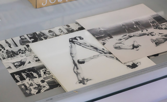
A while ago (October 1st, to be precise) I went to the exhibition 'Anthon Beeke, it's a miracle' at Pier Hein Eek, with school. You probably know Anthon Beeke of his nude alphabet, the curator of the exhibition was Lidewij Edelkoort. Who was also the main curator of the MoBA '13. We had to pick one of his works and make a presentation about it, what it looked like, what it was about, but also what it reminded us off. Tell you more about that, first I want to show you some of the pictures I took. These are only works of Anthon Beeke himself, at the exhibition was also a part about his students. Maybe I'll show you that some other time.
This is the work Pam and I picked. We picked this one because it's so different than the other work at the exhibition, but still very Anthon Beeke because it is just as overwhelming as his other work. It reminded us of offers that you often find on markets but also of old news papers because of the many styles of typography. What you also will notice about this poster is the use of script typography. Script typography is something you see more often these days. In for example logos that are heavily inspired by retro and vintage graphic design. In that respect fits this poster very well in the time that it was made, which is approximately around 1960/1970. But it will also appeal to many people of this generation.
After some research we found out that the poster was made for the Mickery Theater. A theater founded in 1965 that had English and American experimental theater come to the Netherlands for their performances. An other designer that also made this kind of posters is Max Kisman. In his early years he made these kind of poster for Paradiso. The only huge difference is that Max Kisman only uses serif typography. An artist that does use a lot of script typography is Ed Fella.


No comments:
Post a Comment